Technology
- Free wi-fi will be available throughout the terminal.
- Flat-panel screens display arrival/departure information, a "visual paging" system, and informative notes, such as nearby pet-waste facilities and medic stations.

Design
- According to project manager Ray Quesada, the space has been designed to create a "club" like atmosphere. Travelers familiar with Virgin America's cabins will immediately recognize the design concept. Note the Arne Jacobsen Egg Chairs.
- The check-in area was designed to feel like a boutique hotel, with stylish faux-wood paneling and a variety of contemporary furniture.
- Plenty of light, large windows and high ceilings. The ceilings were built as tall as possible without interfering with the sight lines of the control tower.
- The HVAC system is built into the walls, as opposed to the ceiling, to reduce the distance the ventilated air must travel.
- Significant re-use of materials from the previous structure.
- T2's sustainability efforts are slated for a LEED Gold rating.
Art
- Air Over Under by Seattle-based architect Norie Sato: two large pieces on the exterior of the building near the curbside drop-off area.Their surfaces appear pixelated when standing nearby, but bird wing and plane wing images appear from a distance.

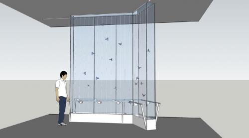
- Butterfly Wall by San Francisco artist Charles Sowers: A interactive kinetic sculpture operated by hand cranks and electronic motors.

- Every Beating Second by Janet Echelman: a sculpture of twine and braided fibers. While it was not yet installed at the time of our tour, a mechanized air flow system has been designed to add movement to the piece.

- Topograph by Kendall Buster: an elevated sculpture near the check-in counters made of steel tubing and cloth and inspired by topographical maps. 
To get your own look at the new terminal, make your way to SFO between 12 and 5 p.m. tomorrow, April 9, for T2's grand opening celebration.