This month, we are pleased to devote The Urbanist
to Unbuilt San Francisco, an ambitious five-venue exhibition that provides an opportunity to confront visions for the region that never came to pass. If San Franciscans like to describe their city as “49 square miles surrounded by reality,” the visionary ideas that were too grandiose for even San Francisco to consider remain some of the most fantastic designs for any city in the world.
The purest and most potent visions of American urbanism, the ones that most deeply convey its aspirations and hubris, are, often as not, the ones that don’t get built. This is true of any city, any region, and it is profoundly true of the nine-county San Francisco Bay Area. From the propulsive thrust of the Gold Rush to the tech boom of today, people come to this place in search of utopia, their utopia, a setting in sync with their ideal of how life should be lived.
San Francisco, after all, is a city perched on the tip of a small peninsula at the edge of a large continent — an act of the imagination rather than the outgrowth of ongoing economic forces such as the ones that fueled the ascension of Chicago and Los Angeles. It’s the capital “C” city of the region yet also a self-defined city of neighborhoods where many residents have little interest in what lies beyond the closest ring of hills.
The architectural results of these insistent, often contradictory impulses are the subject of the exhibits being held at five Bay Area institutions under the broad theme of “Unbuilt San Francisco.” Some of the works have endured in public memory, such as Daniel Burnham’s “Report on a Plan for San Francisco” (1905). Others are forgotten by everyone except history buffs, such as Bernard Cahill’s less ambitious city plan from 1899. Some projects were commissioned by clients ranging from developers and governments to neighborhood groups eager to offer an alternative to the proposals put forth by the powers-that-be. And some are the elaborate dreams of architects who, constraints notwithstanding, strove to make us see the potential of our surroundings in a fresh way.
Not all of the visions are confined to San Francisco. Nor have we made an effort to fit them into a simple storyline with a moral at the end. Our aim is to explore the landscape that might have been, an alternate universe that in turn offers insight to how we live today.
Unbuilt Yet Influential
An unbuilt vision often has lasting implications. It is the action that causes a reaction, the emphatic move that sets an unexpected chain of events in motion.
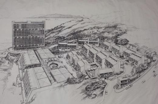
Consider the 1969 design for a new residential district at Lands End, filling the cove below the Cliff House that today contains open bluffs and the ruins of the Sutro Baths. Designed by the well-regarded architectural firm of Wurster, Bernardi & Emmons for a private developer who sought to built a resort community, the lone roadway would have wound past woodsy townhouses down to a stepped-back seven-story block facing the Pacific, with a 20-story building to the north. If the barrack-like townhouses were reminiscent of mid-century dorm housing at a small liberal arts college, the oceanside block would look at home in Cancun.
The cove at Lands End where Sutro Baths once flourished was the site of proposed resort developments in the 1960s and 1970s, such as this one designed by Wurster, Bernardi & Emmons.
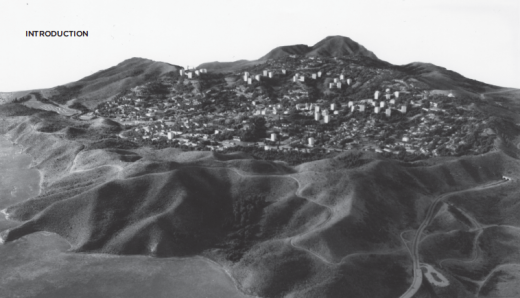
It is hard to believe anyone would have taken such a formulaic approach to the one-of-a-kind treasure that is our coast. But it was a serious proposal dating back to 1965, the same year that the Marin County Board of Supervisors approved the master plan for Marincello, a planned community with an intended population of 30,000 people on 2,100 acres of the Marin Headlands.
Marincello, a vast subdivision for the Marin Headlands that was approved by the county in 1965 but unbuilt beyond the entry gate (below), was among the controversial Bay Area projects that led to creation of the Golden Gate National Recreation Area. Model of Marincello development, 1967 and photo of Marincello Gates courtesy of National Park Service, Golden Gate NRA.
Look beyond the particulars of these projects and what you’ll see is the bottom-line mentality of the age, the mindset that empty or underutilized spaces were voids waiting to be filled. You’ll also grasp why the Bay Area’s environmental movement caught fire in the 1960s: Regular citizens saw the need to defend the natural spaces around them. Without the perception of imminent danger, there’s no incentive to fight back. With projects like Marincello and the Lands End enclave came the threat of permanent loss, and this fueled the drive to create the Golden Gate National Recreation Area — an unprecedented urban national park that today includes both areas. The original projects may never have come to pass, but their impact is lasting and profound.
Other failed quests have more subtle repercussions, exposing the public to architecture that differs from the norm. Certainly that’s the story with the 10-story Prada boutique the design of which was unveiled in 2000 for the corner of Post Street and Grant Avenue, one block from Union Square. Dutch starchitect Rem Koolhaas and his Office for Metropolitan Architecture envisioned a partially submerged, open ground floor topped by a pair of four-story cubes skinned in thick, bead-blasted steel and riddled with 8,000 glass portholes. In between the cubes would be a public terrace and coffee bar, hidden behind mesh but open to the air.
The Prada flagship designed by Rem Koolhaas met with local opposition but was cancelled due to lack of funds. Digital rendering of Prada’s West Coast Epicenter courtesy of OMA (2000).
Never mind that Koolhaas was the 2000 recipient of the prestigious Pritzker Architecture Prize; his design set off months of debate before it was approved by the Planning Commission, despite the objections by staff who said it would violate the sanctity of the historic conservation district around Union Square. So why is the building in the exhibition? The commission gave its blessing on September 6, 2011 — five days before 9/11 and months after the dot-com boom began to fade. Winning the necessary approvals is one thing. It’s another thing to finance a high-concept boutique that included such embellishments as a baseisolation system to lessen the impact of earthquakes — as if the dresses and shoes inside were as fragile as the historic architecture of City Hall, where the expense of base isolation made sense. Eventually, Prada gave up the fight and put the corner up for sale, moving into an expansive restored space across the street.
By challenging convention, Koolhaas and Prada forced the city’s decision-makers to acknowledge that 21st-century city building can’t simply reproduce the past. We need room for surprise. A few years later, another developer (Grosvenor) and architect (Brand + Allen) proposed to wrap the existing building at 185 Post with a sleek veil of glass, like a jewel box with the past displayed inside (not that the brick structure underneath is a treasure, even by all-old-is-good standards). Planners happily waived the concept through, if only to show they weren’t out of touch. The result is as distinctive in its own diaphanous way as the portholed cubes of steel would have been.
Provocative Visions
Another aspect of the most ambitious unbuilt work is that it can distill the goals and fears of an era with a clarity that often is more revealing than what got built in its stead. We see the initial impulse, rather than the filtered result of political compromises, value engineering and bureaucratic nips and tucks.
That is true of Koolhaas’ provocative Prada building (which looks almost tame today). It is equally true of the five reed-like towers that another Pritzker Prize winner, architect Renzo Piano, conceived for the northwest corner of First and Mission Streets in 2006. Piano likened the septet to a cluster of bamboo stalks — albeit bamboo stalks climbing 600 to 1,200 feet, amid alleyways and older buildings just a few stories tall.
“It’s a sad story . . . I loved that project,” Piano said later of his scheme, which never saw the light of day beyond an article in the San Francisco Chronicle when the initial plans were filed with the city. It’s a project that, in retrospect, signaled the high tide of a boom, the mass delusions that come when the good times are so good that developers convince themselves that this time things are different, this time the bubble won’t burst. How could economics justify straight square towers reaching 300 feet beyond the Transamerica Pyramid, yet so slender that their typical floors would be less than half the square footage of other towers nearby?

Renzo Piano in 2006 conceived a mixed-use complex for First and Mission streets that would have included 1,200 foot towers. Architectural rendering courtesy Renzo Piano Building Workshop.
But Piano’s far-fetched cityscape was also enthralling. What he contemplated was an elegant riposte to the skyscraper games of the past decade, the relentless quest for novelty from Guangzhou to Dubai. His towers were clad in terra cotta rather than glass, had clean lines rather than pirouetting forms, were self-effacing and sky-busting at once. The ground-level weave of pathways in its own way was the most willful act of all, a medieval terrain beneath heights categorized by the profession as “supertall.”
A statement like this could only be made at a moment in a city’s history when the future seemed open to audacious acts of design imagination. Other potent visions in the exhibitions respond to aspects of the future that seemed grim.
The most obvious example of the latter might be the efforts to accommodate the automobile in the decades before and after World War II. Like every city in the country, San Francisco was confronted by a fast-increasing number of automobiles trying to navigate streets that often had been mapped before the car was even invented. The answer, said many “experts,” was to stretch a new net of roadways above the city. One such scenario came from Donald R. Warren Co., which in 1943 proposed to ring Union Square and the Financial District with a six-lane thoroughfare that would have space underneath for 10,000 cars — a misguided proposal that helped clear the way for the double-decker roadways along the Embarcadero and west of City Hall that in turn spawned the locally fabled “Freeway Revolt” in the early 1960s.
For San Franciscans of today this might be the most harrowing what-if of all, a city sliced and diced beyond recognition. Yet these early engineering schemes were rooted in a truth of their time: Traffic was a very real issue that was being addressed with technical efficiency. There were architectural responses as well, such as the confounding but alluring designs by landscape architect Lawrence Halprin for the so-called Panhandle Parkway. There’s a sinuous beauty in his renderings of concrete curves snaking through the landscape toward Golden Gate Park, the visual poetry that results when one of the Bay Area’s most lyrical designers strives to imagine an urban world that can accommodate the automobile. The parkway did not come to pass, thank goodness, but Halprin’s participation shows the extent to which the conventional wisdom of midcentury America saw automobiles as a necessity of modern life.
Visual Seduction
Whatever the era, whatever the style or scale, the strong thread binding the exhibitions is the power of imagery to open our minds to contemplate new urban forms.
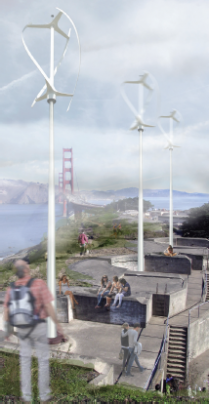
Architects, after all, are visual creatures: bold images become a way to tell a story, make a point. One recent example, modest in scope but alluring in execution, is architect Charles Bloszies’ notion of adding windmills to the oceanside bunkers of the Presidio to harness energy. We know such an idea would never be allowed in such a carefully scrutinized national historic district tucked inside a national park. Then we look at Bloszies’ lyrical depiction and wonder, why not?
Architect Charles Bloszies’ “Recycled Batteries” (2008) proposed that the old and vacant bunkers along the coast be transformed into wind turbines to create energy for nearby buildings.Courtesy the Office of Charles F. Bloszies, AIA. Digital rendering by Melissa Lee, Lloyd Paul, Miriam Bodino (2008-2013).
This is not a recent trend: the brash aura of Vincent Raney’s proposed United Nations Capitol makes you wish he had captured the international eye, even if in real life it would have been modernistic grandeur run amok. Nor is this bold imagery confined to single structures. Daniel Burnham’s plan for San Francisco was commissioned by a group of businessmen, and the text that accompanies it is pragmatic, spelling out the details of a plan “so devised that the execution of each part will contribute to the final result.” But Burnham’s accompanying illustrations conjure up a gauzy realm of Greco-Roman splendor, such as a palatial public stairway up the side of Twin Peaks. This is the true City Beautiful, and you can understand why the plan’s reputation endures, even if few of its recommendations were followed.
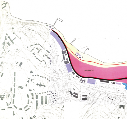
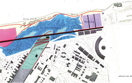
Visual beauty has the power to shape discussions and plant a seed. So do straightforward diagrams as was the case when Hargreaves Associates did a series of conceptual studies to restore Crissy Field along the bay. We know the final result: the spacious marsh next to a vast lawn that memorializes a longgone airfield. But the landscape architects didn’t have a free hand: The interest groups assembled by the National Park Service ranged from military historians to native plant buffs and wind surfers. In response, the Hargreaves team assembled six large imaginary site plans, theoretical approaches to the 100-acre site. The most audacious of these plans reintroduced marshes and extended them inland past Mason Street, turning that road into a causeway and pulling the green of the Presidio Main Post down toward the bay.


As Hargreaves Associates prepared to work on a design vision for Crissy Field, the landscape architects drew up six “park frameworks.” This one conceived of an extensive set of marshes that in turn would blend with an enlarged Main Post Parade Ground, while a portion of Mason Street became a causeway. Drawing of Crissy Field courtesy Hargreaves Associates.
Such a move was not to be; nonetheless, the strong, colorful site maps offered a glimpse of the area’s ultimate potential. Eventually, two approaches were presented to the public, one with a marsh alongside a lawn and one that paired the lawn with dunes. The result is the most treasured new open space in the Bay Area in a generation, and a marsh is among the main attractions. To the south, Doyle Drive is being rebuilt and lowered so that, yes, a recreated landscape can spill down from the Main Post to the bay.
That, in the end, may be the most intriguing thing about San Francisco’s false starts, the roads not taken, the buildings and plans that never fully came to pass. They form a city of shadows. Some make you smile; some make you recoil. Many were ahead of their time. They showed us what could have been — and what might still might lie ahead.
